And to think I was so pleased to find out that I wouldn’t actually be needing the new Too Faced Chocolate Bon Bons Palette, so I could save some money. Nope. Didn’t happen.
Not too long after, Vice 4 hit. And it hit hard. My little chilly heart skipped a beat when I first saw the packaging.
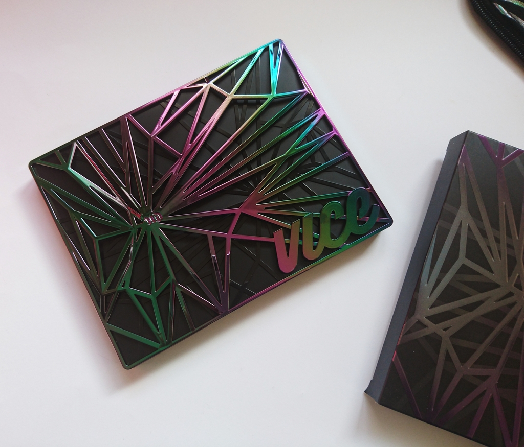
How? How can you be so awesome? Who designed you?! Olafur Eliasson?? You belong in the Guggenheim!
Whoever was in charge, definitely hit the nail on the head with this one. The outter box has the same pattern and color scheme printed on it, the pouch that comes with the palette (IT COMES WITH A POUCH FOR CRYING OUT LOUD!) has the same pattern and color scheme printed on it, soon my face will have the same pattern and color scheme printed on it.
The pouch is amazing, because much like an expensive pair of Louboutins, every single thing of such great beauty deserves its own dust bag. But to be honest, we both know that I will not keep the palette in the bag. That would make it impossible for me to stare at it all day, something that I am planning on doing full time, effective immediately. Let’s talk inner beauty now, shall we?
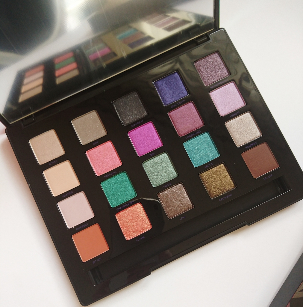
You open it (angels singing) and you suddenly get that warm cosy feeling of owning something so special, it only happens once in a blue moon. Let’s take a closer look.
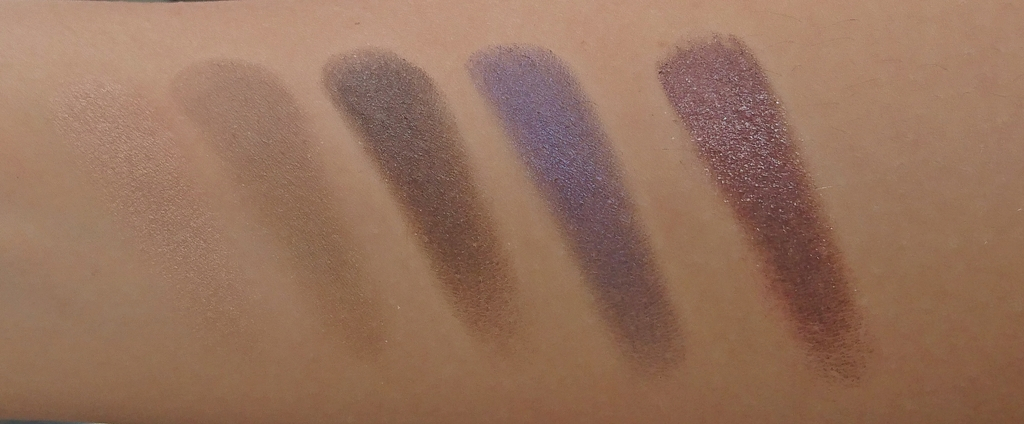
I have it in my posession for less than half a day, but I couldn’t wait to put my hands and face in it! So I swatched, and I dag my brushes in! And here’s the aftermath…
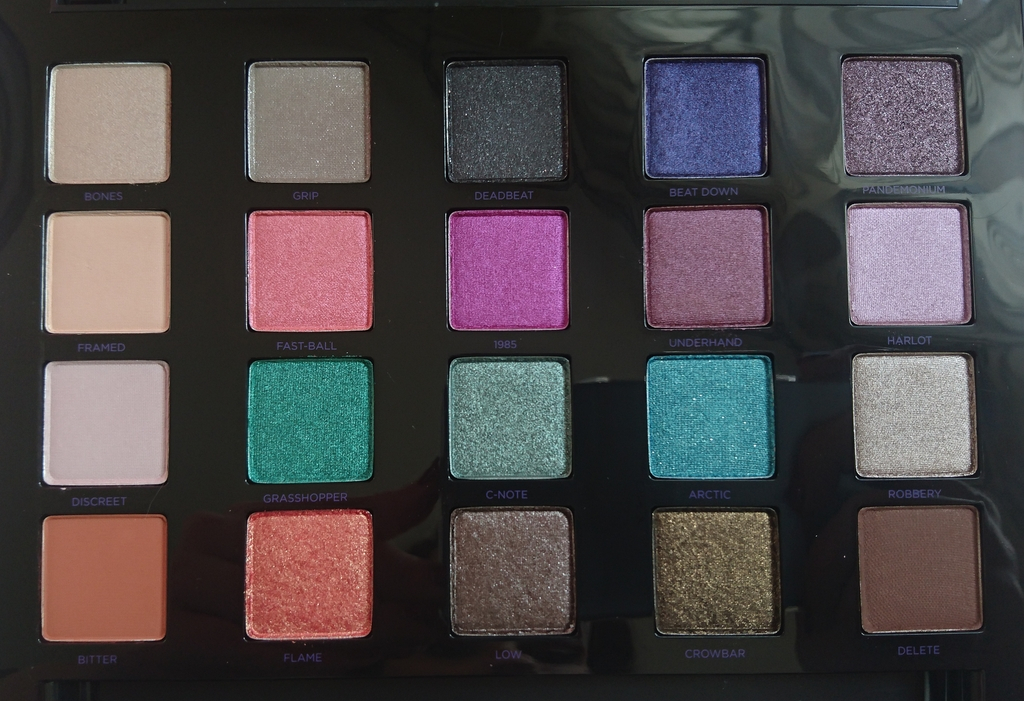
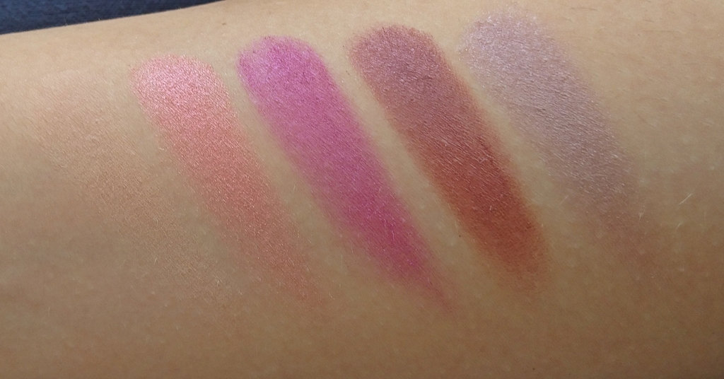
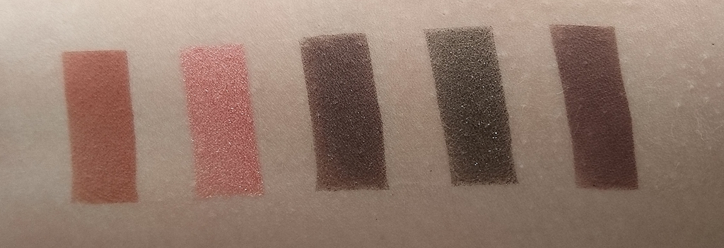
Row Numero Uno:
Bones : “Oyster satin with a pearlized finish”
Grip : “Taupe matte with iridescent micro-glitter” ( I don’t see the iridesence but, ok)
Deadbeat : “Black satin with iridescent micro-glitter”
Beatdown : “Deep metallic violet with blue micro-glitter”
Pandemonium : “metallic plum wwith iridescent micro-glitter” (eh, kinda…)
Or as I call it “The mysterious”. I see those purplish shades and the black and I imagine myself being in the ad for Givenchy Ange ou Demon.
Row Number Two:
Framed : “Light neutral matte-satin” (peachy)
Fast-Ball : “Metallic peachy pink with pink micro-glitter”
1985 : “Metallic fuchsia with fuchsia micro-glitter”
Underhand : “Burgundy-brown satin” (yeah, baby…)
“The Rebel”. That fuchsia speaks to me. Well, the whole row speaks to me, we have been having a conversation for hours…
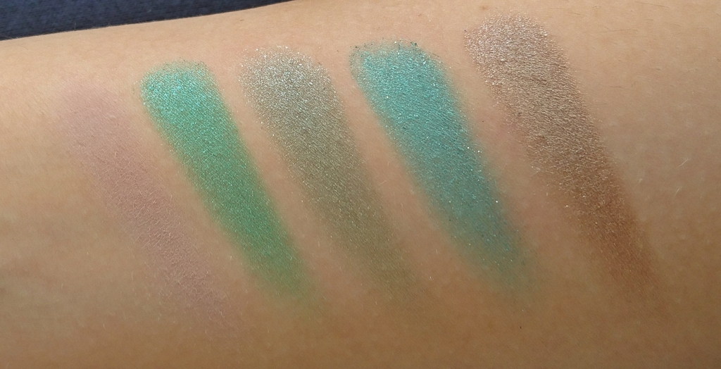
Row Number Three:
Discreet : “Soft dusty mauve matte” (more like really pale taupe)
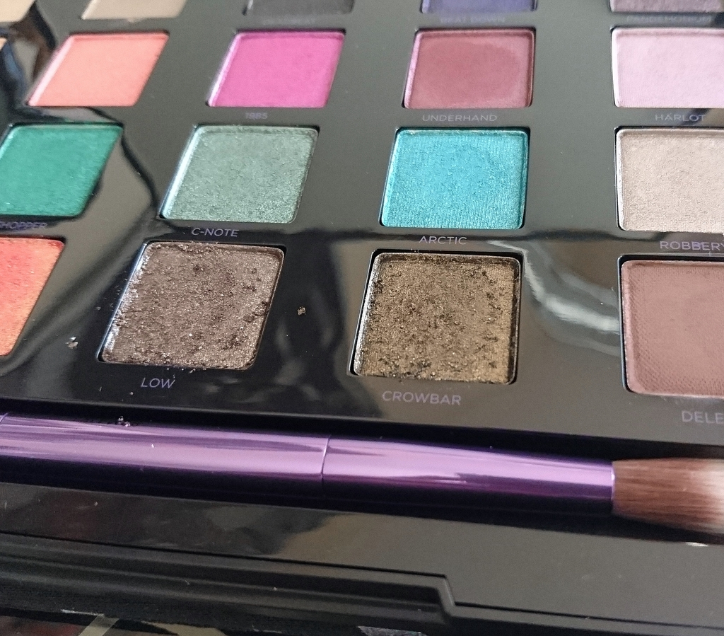
Grasshopper : “Metallic emerald with green micro-glitter”
C-Note : “Frosted green with micro-glitter” (moss green I would say)
Arctic : “Bright teal with tonal sparkle” (what the hell is tonal sparkle?)
Robbery : “Deep metallic brown-gunmetal” (that is by far the most off description, it’s a taupy champagne with a slight mauve undertone)
“The Forest Creature”. Imagine and elf doing the nasty with a mermaid. Freaky stuff, huh? Stop picturing it, you perv!
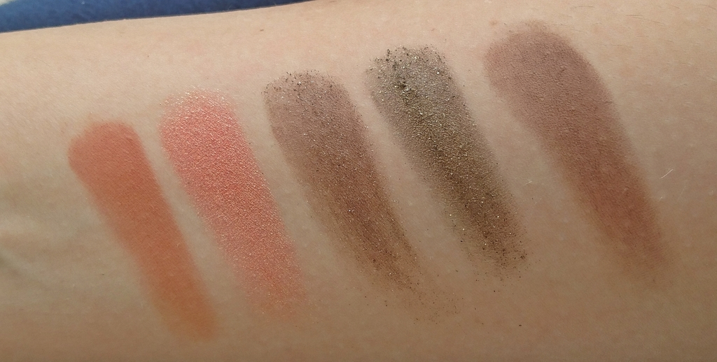
Row Number Four:
Bitter : “Reddish brown matte” (oh yeah, that’s the spot…)
Flame : “Bright orange with gold micro-glitter” (oy!)
Low : “Brown matte with iridescent micro-glitter”
Crowbar : “Black with golden metallic pearl and micro-glitter”
Delete : “Deep chestnut brown matte-satin”
“The Contemporary”. Or what would have been…
The last is by far the most controvertial row of all. Not color wise but in terms of consistency. Bitter, Flame and Delete are extraordinarily pigmented and buttery smooth and the other two are… a disgrace to Urban Decay’s name.
There I said it. It’s not all fun and games. Those shades would be stunning, especially Crowbar, BUT DEAR OH DEAR they suck. The fallout. The patchiness. THE HORROR!!! The situation can be salvaged with primer, but still.
This palette was priced at $60 (it’s now $39 on the website), so I expect $60 quality. Throughout the palette. Consistent. Damn it! I am not going to even begin discussing how you only get o.6g of product in each shade of shadow. I wouldn’t mind if they were all actually very high quality shadows. But things like this really piss me off!
This whole situation reminds me of a quote from Joey in Friends in that episode where he dates pregnant Rachel and asks her to show him her end-of-the-date move. “Boy, Rach, you’re lucky you’re hot.” If you don’t know what I’m talking about, go watch S08E12 of F.R.I.E.N.D.S. and come back here.
And it’s just that. If i weren’t absolutely and utterly mesmerized by the amazing packaging and the fact that this palette is limited edition (btw, what’s with the other Vice LTD palettes? like the regular Vices arent’t LTD? Pfff) I really doubt I would pay what I paid for it. You live and you learn…
By the by, since I have been getting the chance to play with a lot of new makeup lately, please let me know if you would like maybe see a video tutorial using the Vice4…? *runs away red with shyness*
Editor’s Note : I used “Underhand” as a base shade, blending out with “Bitter” in the crease and “Framed” as a transition shade today. Popped some “Flame” in the middle with a damp brush and smoked the upper and lower lashline with “Delete”. Boy, oh boy. I loved it. Not to mention that I took a nap with them on, by mistake. No primer, they didn’t move. *thumbs up*